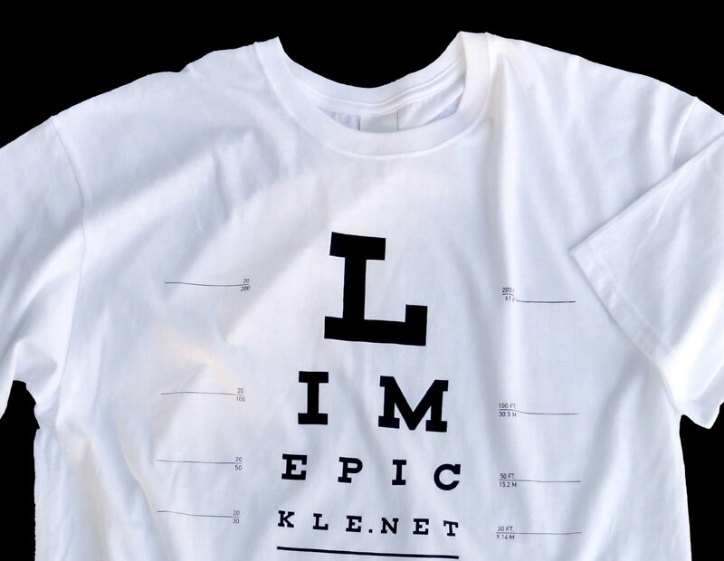
Limepickle
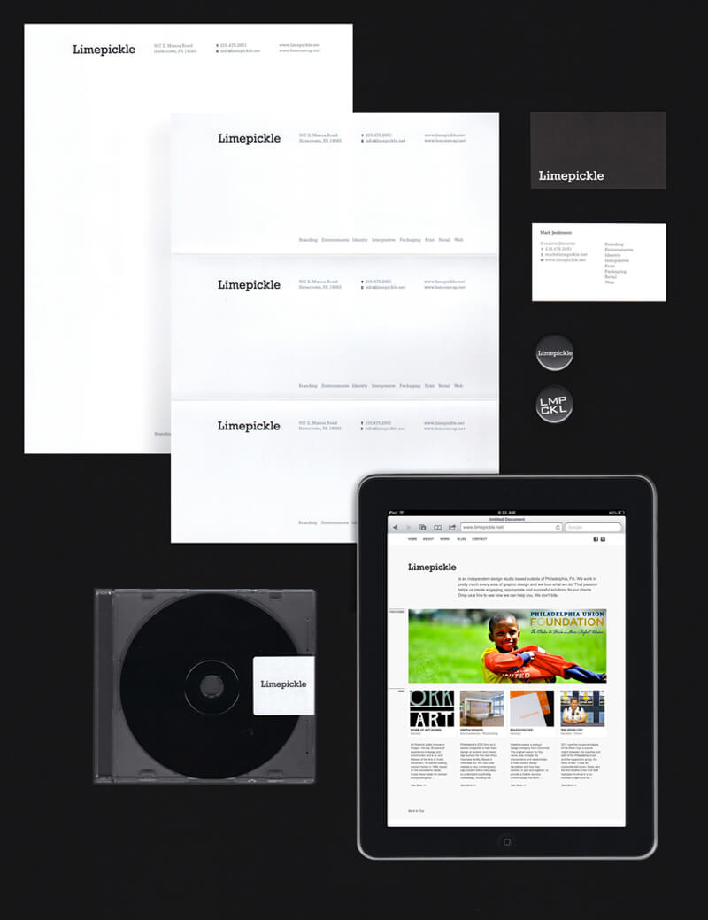
This is the identity system I designed for myself as a freelancer, contractor and consultant. I was driven by 4 things; The Name, Simplicity, Reproduction and Cost-effectiveness. The Name - Limepickle - is an Indian condiment that is served cold with poppadums. Like me its an acquired taste ;-) but it's also one of my favorite foods so it has personal meaning. Since it's a relatively unknown food in the US, the name always provokes conversation, which makes it memorable. The temptation with a name like this (that has a fruit as part of the nomenclature) is to use predicatble, associated colors, which is something I wanted to avoid.
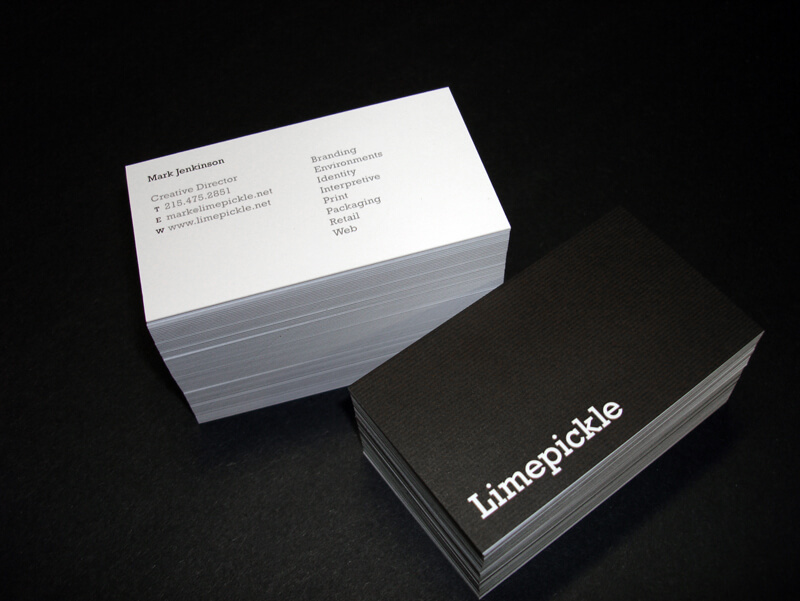
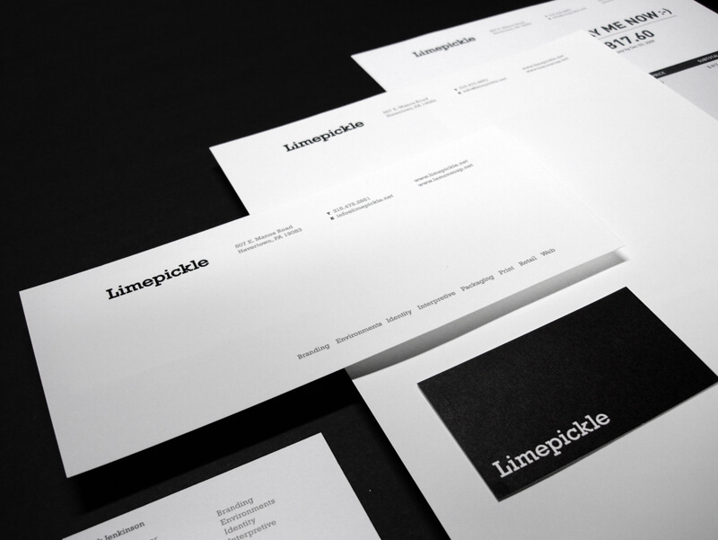
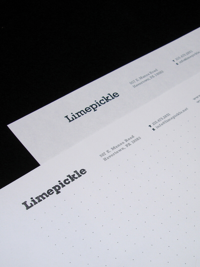
Simplicity - As a startup, I wanted an identity that was as economical as it was sharp - with a focus on using as few resources as possible. I also wanted to avoid any colors alluding to the name. Using a monochromatic design kept printing costs at a reasonable level and allowed the identity to be bold and striking on its own, whilst also being recessive when being used next to my clients' identities and brands.
Reproduction - Since I issue most of my paperwork electronically, the clients will print any correspondence themselves should they need to. Since I can't control the calibration of their printers to get an exact representation of my 'colorways' I chose black and white.
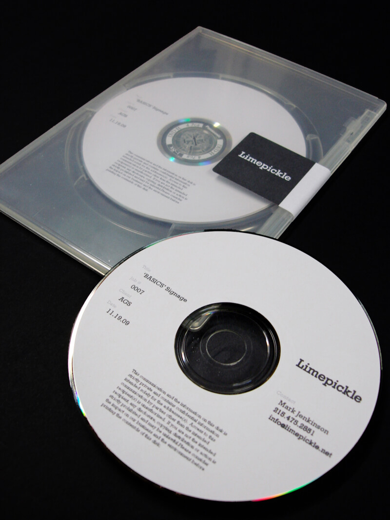
Cost Effective - The electronic issue of documents eliminates the need for paper but where physical hardcopies are necessary, a suite has been designed that includes 1/3 letter sized notecards (for smaller messages) and cd/dvd cases from recycled plastic. - replacing the need for sleeve inserts with a simple avery label. Using black disks helps keep the package on brand. It's all about using less resources and getting an optimal result.
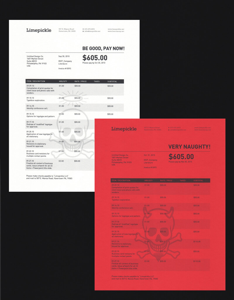
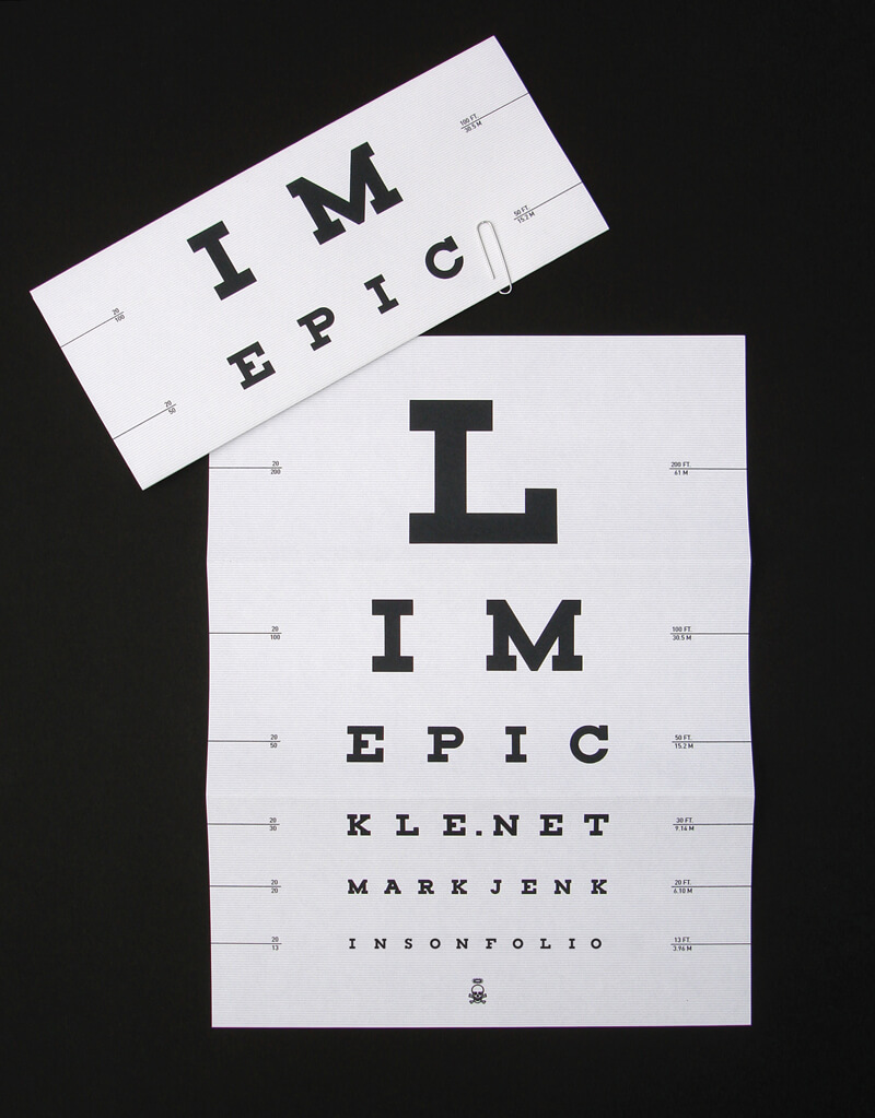
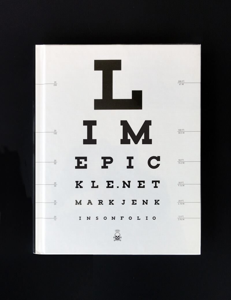
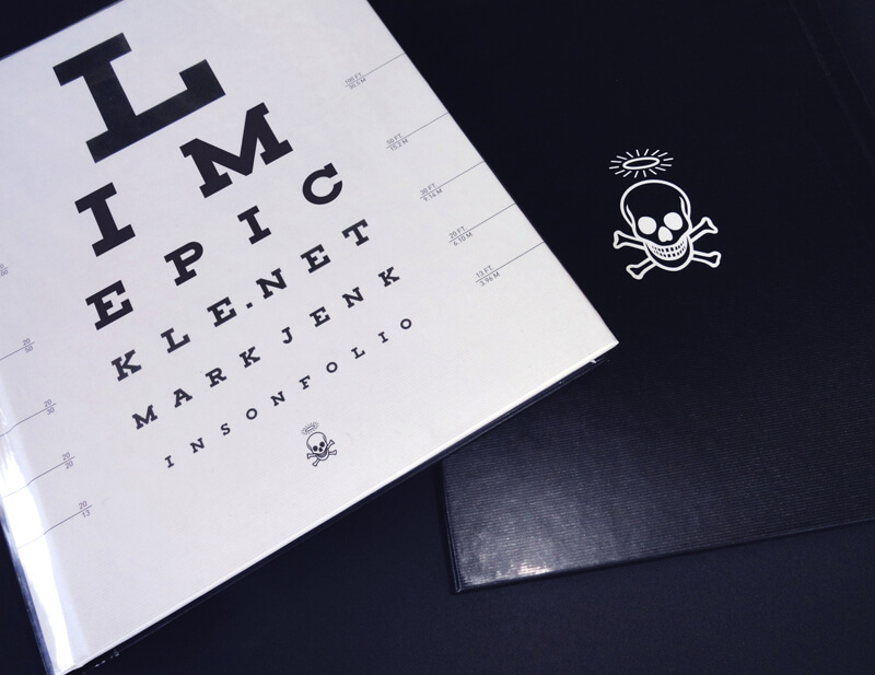
The identity also has some simple but joyous elements to alleviate the starkness of the monochromatic identity; The skull and crossboneswith halos and horns on the invoices, the hand drawn masthead on the sketch paper (I do a lot of thumbnails), and the eye chart portfolio cover, as well as some pins that point to my roots as a designer in London.
