whim·sy | \ ˈ(h)wim-zē \ variants: or less commonly whimsey • plural whimsies also whimseys • Definition of whimsy. 1 : WHIM, CAPRICE. 2 : the quality or state of being whimsical or fanciful the designer's new line showed a touch of whimsy. 3 : a fanciful or fantastic device, object, or creation especially in writing or art. Basically there are jobs we do that can't be defined by verticals and categories, maybe it's a one off design, maybe it's just some self indulgence. Not everything needs a huge amount of strategy and business accumen behind it. These are some projects designed to raise a smile (or an eyebrow) depending on your viewpoint.
Rawls & Co.
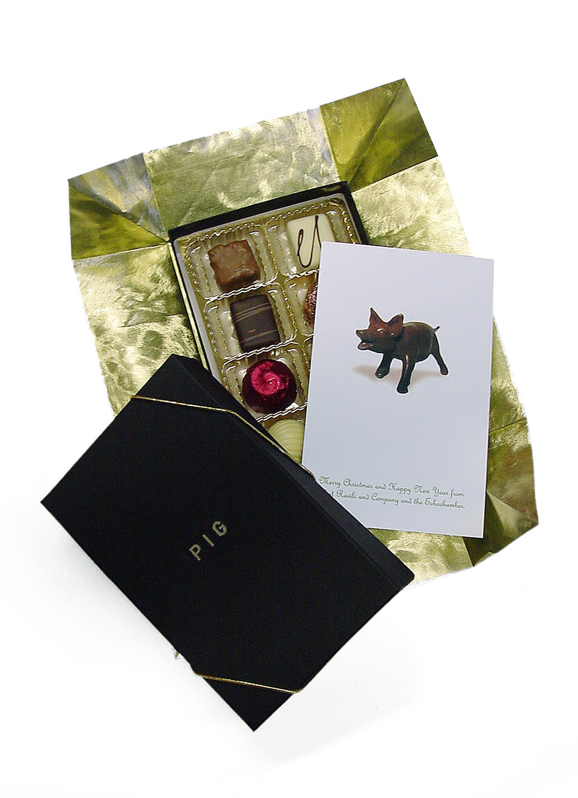
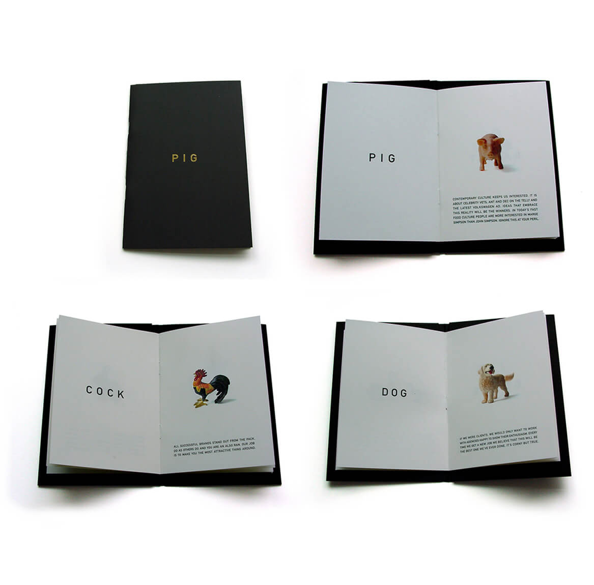
This little 'PIG' went to market! A small, promotional brochure that aims to get past the '10 seconds and bin it' factor by being a precious little book rather than a standard marketing brochure. The company's attitude, humour and philosophy are reflected through words rather than pictures of work. In a market saturated by trumpet blowers, this project's success relied on understatement. The cheeky Christmas gift of Belgian truffles, six months after the inital mailing, served as a timely reminder to pick up the phone and give them a call.
Designed whilst Senior Designer at firm: Rawls & Co
Saint (+ Sinner)
When designing this identity for a gin and vodka brand/packaging proof of concept, it became clear that it was the perfect place for an ambigram. Perfect for representing the duality of the concept flavor profiles but also the duality in the packaging that was developed that had one bottle upright and the other inverted. By using a single mark both products were able to be branded. The fun twist was that in order to pour from either bottle you had to be a Sinner. And when you left it alone, you were a Saint.

The Adventures of Sally Soaphands™
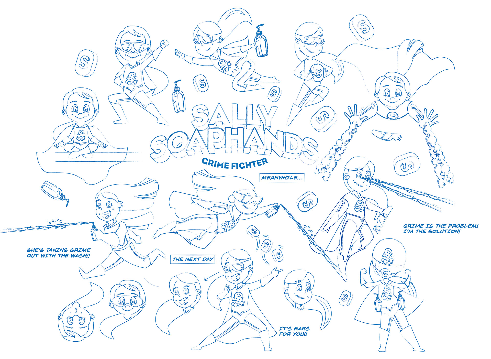
A client I'd done some movie work with, and was also in conversation with me about some comic book identities, asked me if I would convert his daughter's sketch of herself as a superhero into an actual comic book character - with poses, and comic covers, and the POWS!. So welcome to the Marvel(lous) world of Sally Soaphands. Grime's the problem. And she's the solution (see what we did there?).

Hesher®
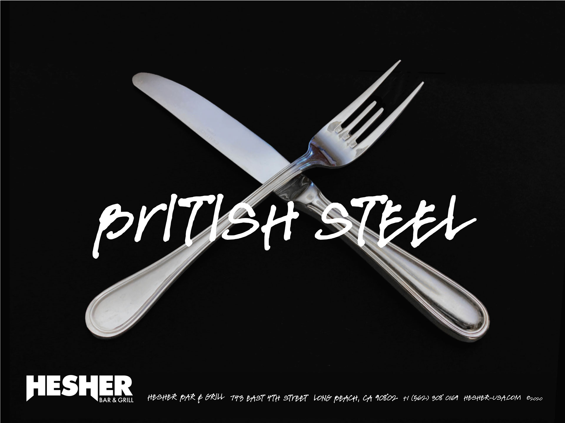
Just before lockdown a restauranteur in California connected and said that they were opening a Hard Rock / Metal type bar and grill in Long Beach. Immediately trying to avoid any hard rock cafe type references the identity was based upon a ‘heavy metal’ type logo. After a few iterations of skull and crossbones with crossed knives and forks, I got some cutlery filed down to make the fork into some rocking devil horns. Stainless Steel is made in Britain so ‘British Steel ‘ was not just a reference to the cutlery but also a reference to the Judas Priest album of the same name. The Japanese all-girl kawaii metal band, Babymetal, was the inspiration for the younger children’s menu, and we never got to developing one for the teens. The restaurant got halfway to completion before the funds ran out under CoVid restrictions and, unfortunately, it never saw the light of day.

The Art of Doop
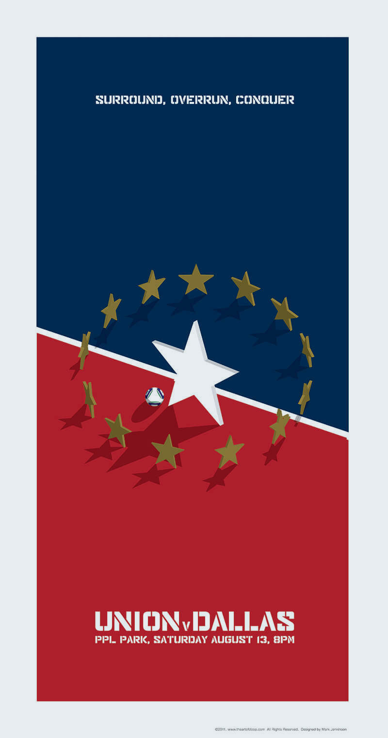
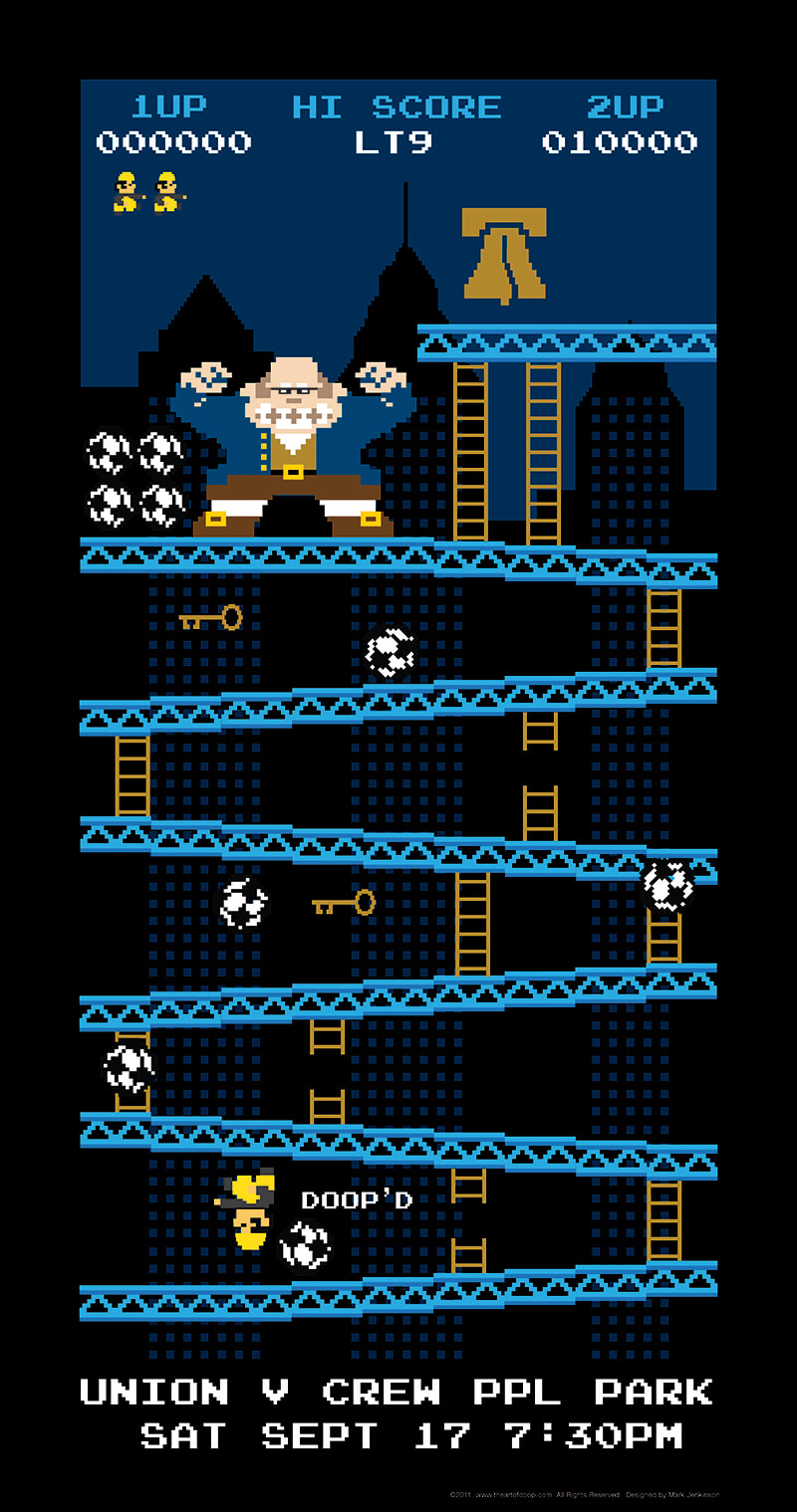
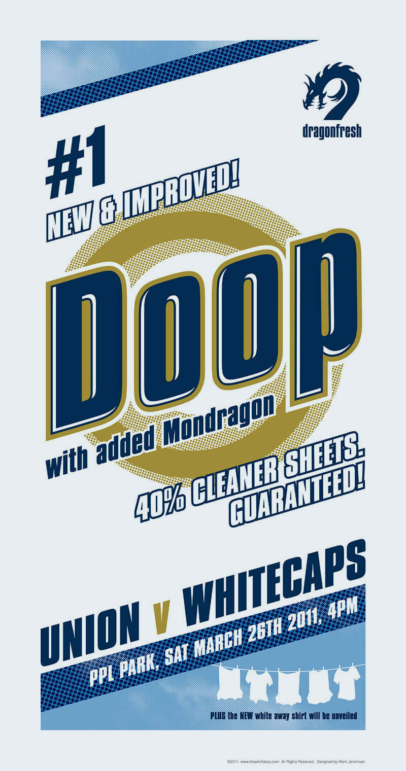
What started out as an exercise in poster design to promote the first game of the season on facebook, has now taken on a life of its own. A collective of several designers who are all passionate about the Philadelphia Union, we now produce 'gig' posters for each home game of the season. Used mainly through social media channels (requests for for prints of the full series have been made) and to promote viewing parties / events. Allowing each artist to express themselves has led to a diverse series of solutions and styles, the only consistency being through the format and the approach that all designs should be positively Union-centric. This project, I have on good authority, started the whole gameday art movement.
Eccles Park Tennis Club.
After a while working on this logo for a tennis club, I had run out of ideas that used a tennis ball, roundel etc... Ugh. So predictable. I ditched all the ideas and I started to think about it differently, something to do with motion. And then the penny dropped about the player movements back and forth either side of the net. With these movements, and allowing the words to move, an identity was happened upon that was fiendishly simple, yet so very different to what the client expected. Needless to say they wanted a tennis ball and a roundel.

The Abandoned Couches of LA
This is an interesting one. I was working on a project for a client doing character development for an animated TV show, when they mentioned that they'd had an idea to do a poster in the same world of "The Doors of New York". Being as irreverant as we were, we were definitely going to give it our own slant and so we came up with "The Abandoned Couches of LA" due to the increasing number of sofas that were being left out in the trash. Months of photography later and this poster was the result.

King of Clubs
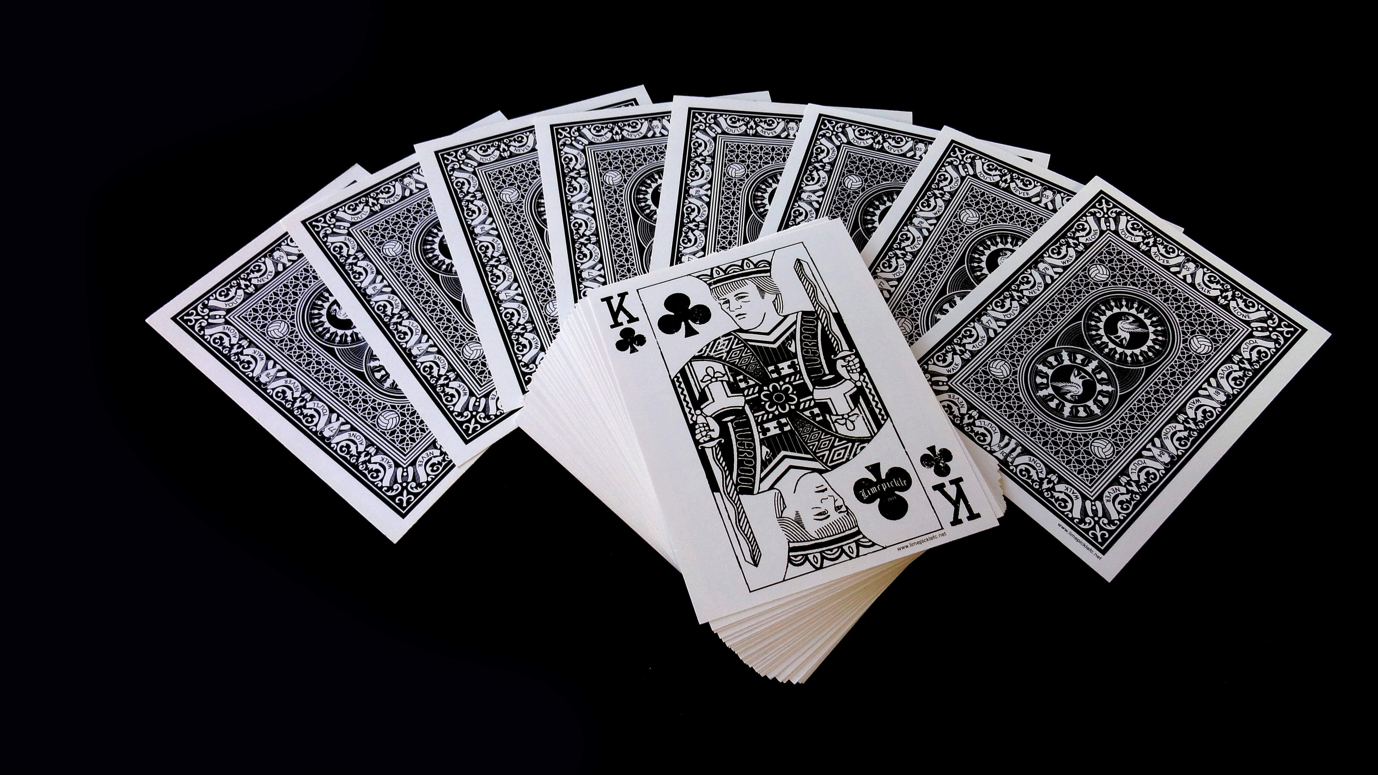
When Kenny Dalglish re-took the reigns at Liverpool FC in 2011 after a 20 year hiatus we, as die hard fans, decided to produce a design to celebrate the moment. Dalglish is known in the football (soccer) world as King Kenny, so the logical thing to do would be to play homage to the man through a reworking of the 'King of Clubs' card from the traditional french deck. The image itself is layered with symbolism from Kenny's glory years with the club from 1977 to 1990. The back of the card tells the history of our great club, from the club motto, to our trophy haul, to the Liverbirdsof the city facing in opposite directions. To cap it all off, these very limited editions shirts were printed with water based environmental inks to capture all the detail in both designs.
Andy's Guitars
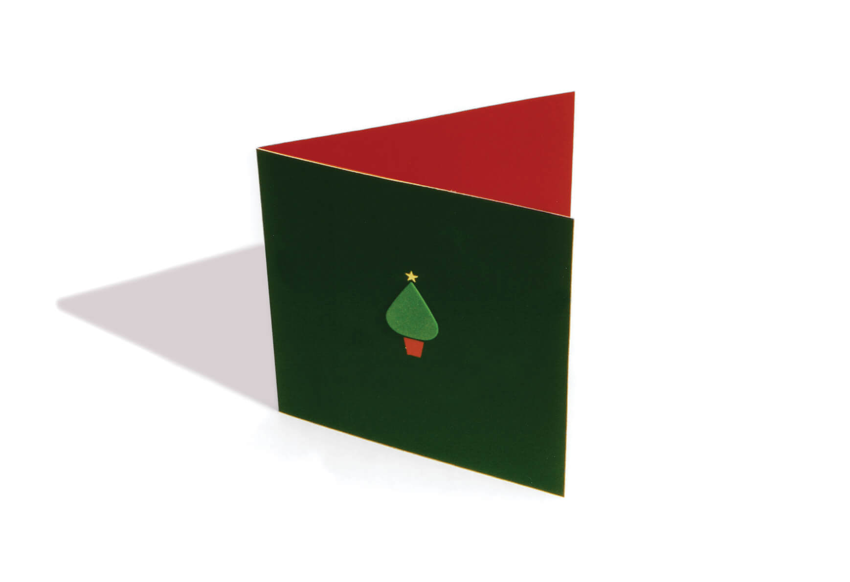
Every designer needs at least one decent Holiday Card in their portfolio. This card for a guitar store doesn't need anything more than a green Tortex pick mounted on the front. It is the perfect shape for a Christmas Tree. The inside of the card reads "Pluck more than a turkey this Christmas." Simplicity. Isn't that what designers strive for?
The Gates to Heaven
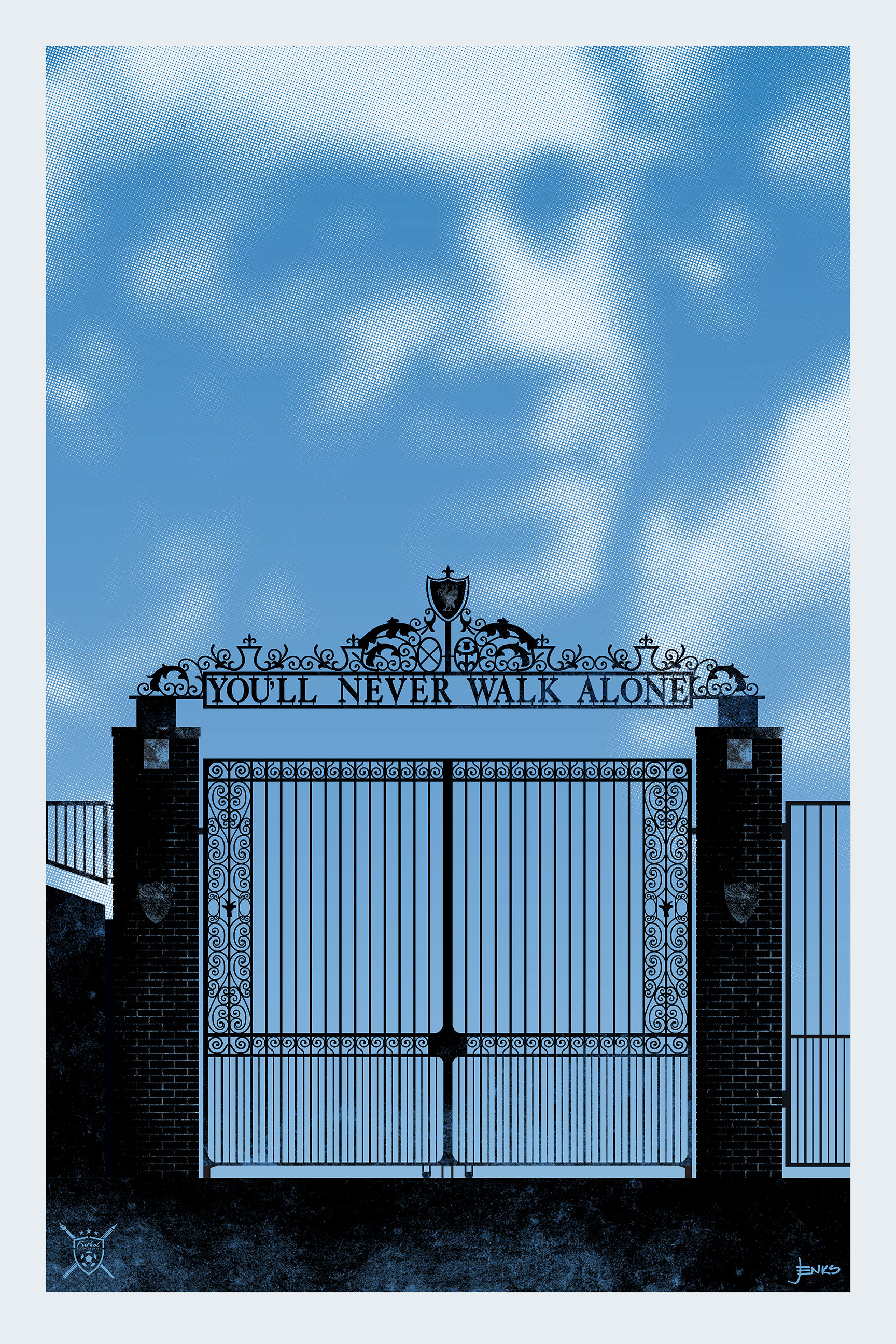
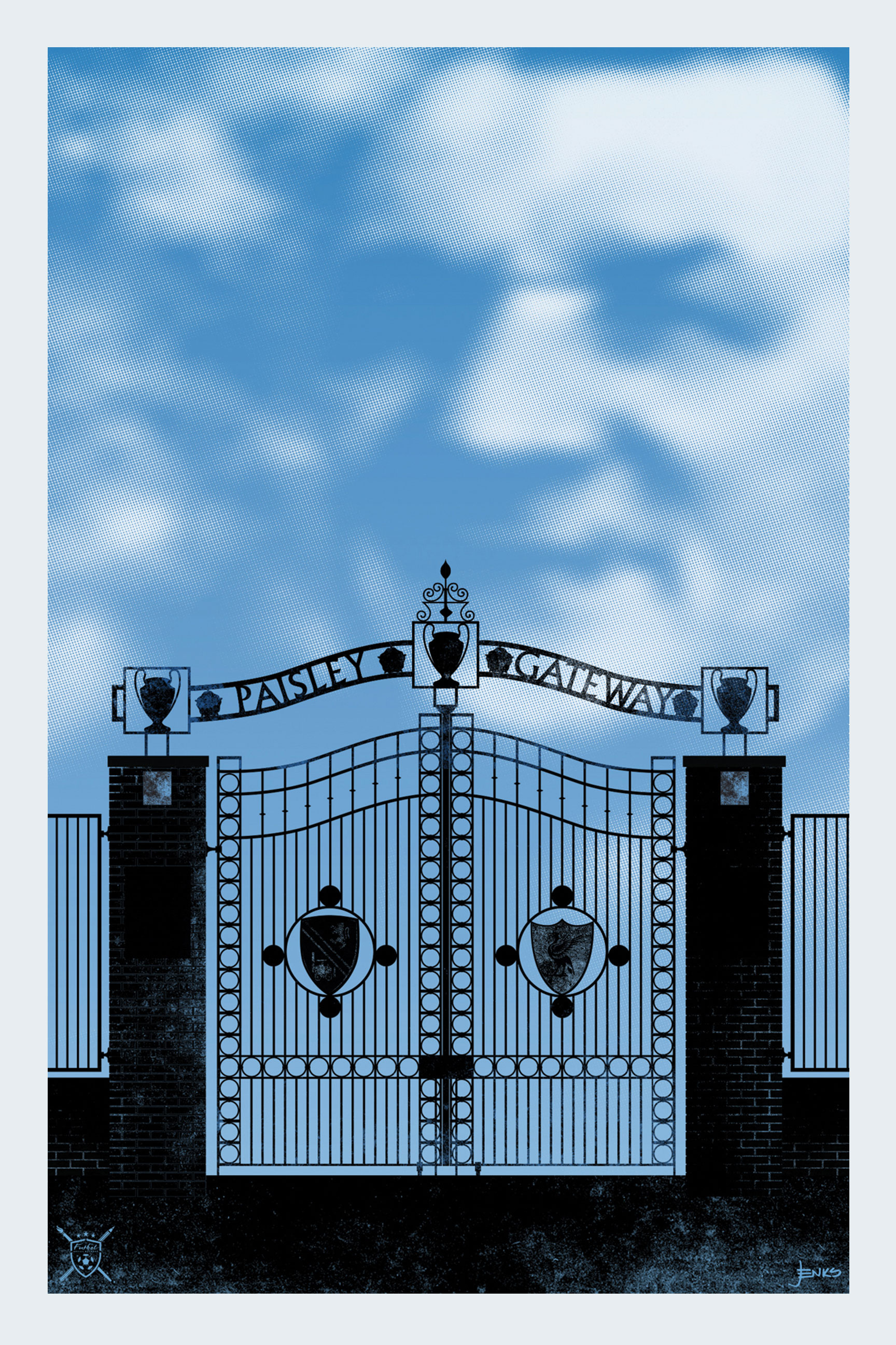
At Anfield stadium in Liverpool, there are two gates dedicated to 2 of our most prestigious managers, Bill Shankly and Bob Paisley. When asked for poster designs typifying something about the team, I really didn’t want to go down the avenue of traditional portraits, so with my background in environmental graphics and drawing elevations, I decided to focus on the beautiful ironwork of the two gates as a kind of silhouette agains a bright sky. The portraits of the 2 great men (now both sadly deceased) are represented in the clouds beyond the gates.
Posters in Red
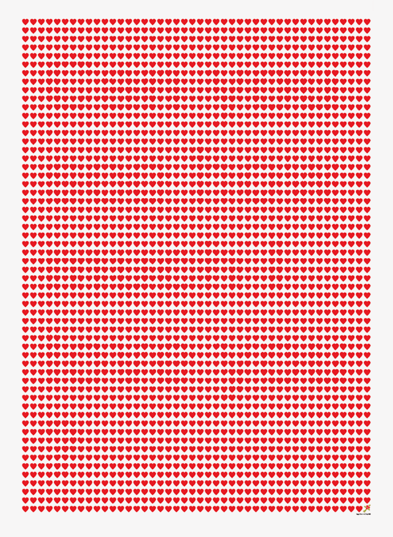
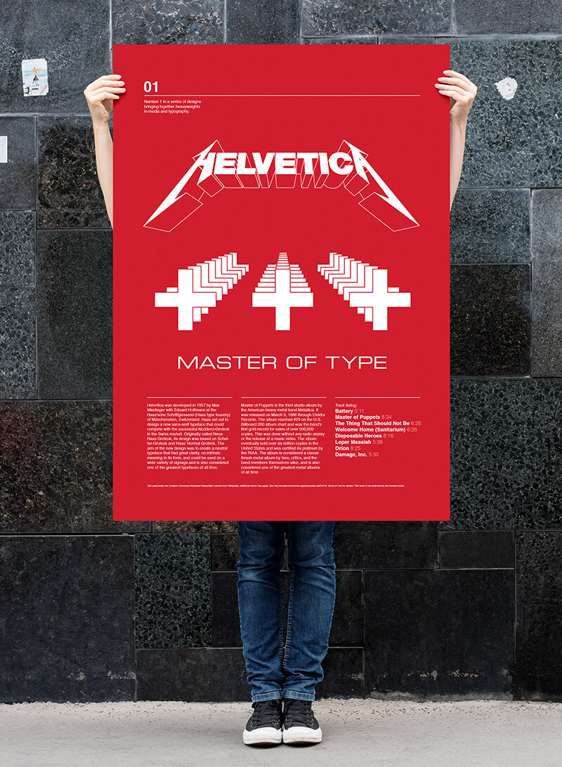
The Valentines Day poster might just look like a grid of mini hearts - each representing a day that my now wife and I were together at the time - but it has a hidden message in the design. If you step away from your desk and take a view from accross the room the message should become clear. While researching some material on another project I came across Helvetica as a Metallica logo, except it wasn't written in helvetica, it was written in the Metallica handrawn typeface. In seeing some similarities between the swiss cross symbol and the band's Master of Puppets cover I put together a poster that brought the two together ironically using the extended square typeface for the title as per the cd cover.
Coffee N Tea
This little 'PIG' went to market! A small, promotional brochure that aims to get past the '10 seconds and bin it' factor by being a precious little book rather than a standard marketing brochure. The company's attitude, humour and philosophy are reflected through words rather than pictures of work. In a market saturated by trumpet blowers, this project's success relied on understatement. The cheeky Christmas gift of Belgian truffles, six months after the inital mailing, served as a timely reminder to pick up the phone and give them a call.

